Lattice
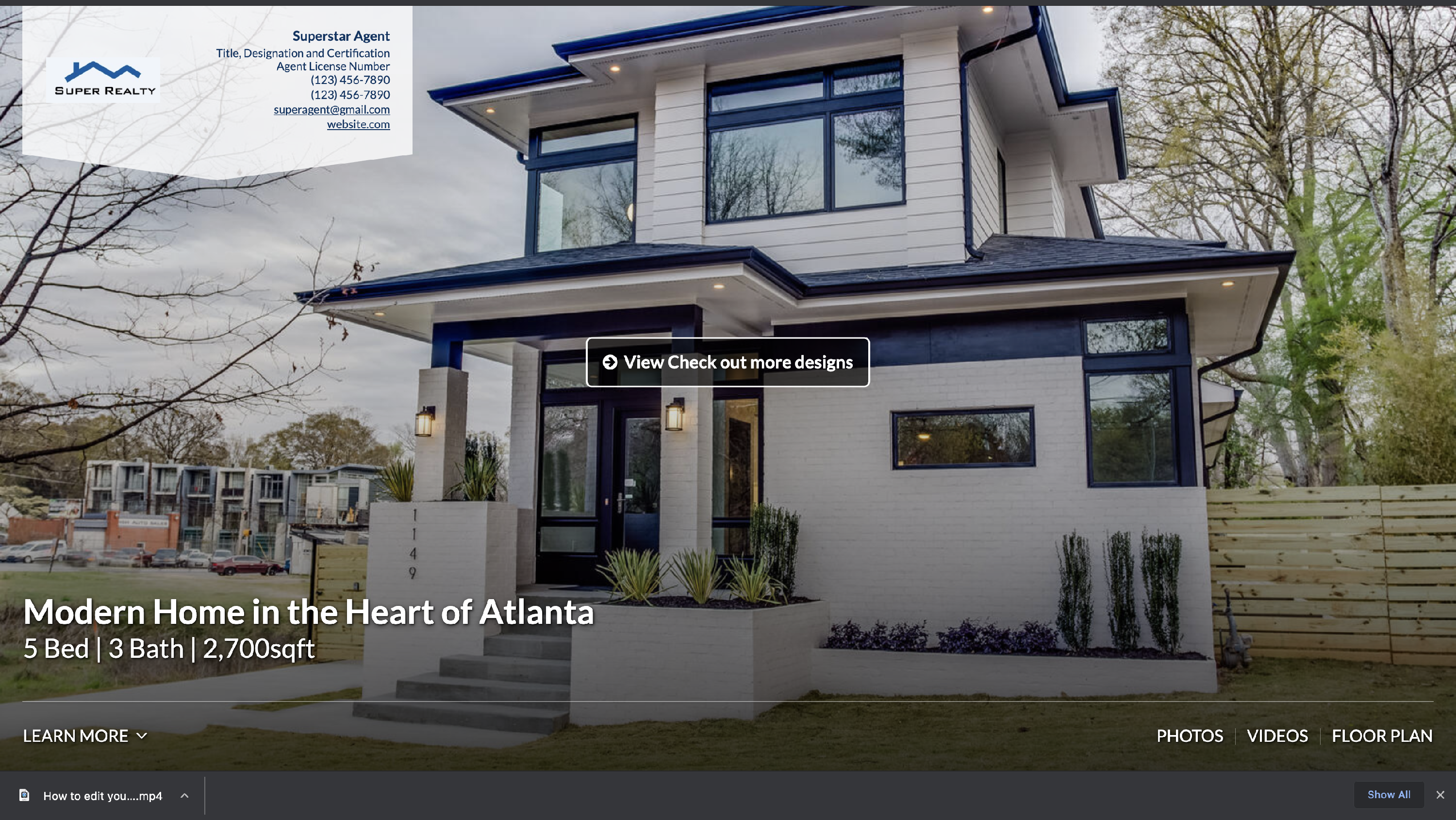
Lattice is one of our single-page property web experiences that allows you to market a property with a website look and feel. Lattice provides a modern, sleek, single property marketing website experience, with agent branding right at the top.
We understand the modern home buyer needs more than stimulating images to drive interest in the home. Other factors, such as schools and businesses within walking distance, are an example of how integration between data and beautiful imagery can deliver value. Lattice seamlessly blends these needs together in an easy-to-consume presentation that is responsive and mobile-friendly.

Lattice Key Features
- Single page experience
- Fully responsive and mobile friendly
- Highlight reel on the home page to showcase 1 still image, 1 video, or multiple images carousel
- Supports all media types: still images, videos, panoramas, Matterport 3D, and floor plans
- Side by side Floor plans
- Hero image at the top of the page with property details overlaid
- Persistent shortcut navigation bar
- Full screen image carousel
- Multiple font support
- Inline contact agent web form
- Stylized masonry inline gallery grid. Each time the page loads, the grid is visually different (the order of assets remains the same)
Please Note
If you make changes in a design, these changes will affect all the tours to which that design is assigned. To avoid changing any old tours please duplicate the design and give it a specific name.
Customization Options


“If you make changes in a design, these changes will affect all the tours to which that design is assigned. To avoid changing any old tours please duplicate the design and give it a specific name.”
Options Defined
Nickname
This can be anything you’d like. For example, if you needed to create a new Lattice option to reflect the colors of Keller William, you can set the nickname to “Lattice [Keller Williams]” to make it easily stand out.
Colors
This design provides several color customization options to create designs unique to you and your clients. You can find out more on how to utilize these settings here.
Base Font
This setting defines what font will be reflected within the descriptions of each section.
Headline Font
This setting defines what font is used within the menu, hero images, and titles of each section.
Display Style of Agent Branding in Header
This setting lets you display an agent's information as a header.
Show Agent logo, headshot, or both in agent header section
This setting lets you define whether the agent headshot and/or logo appear in the header of the page.
Set size of agent headshot and logo in agent header section on desktop. Only applies when agent header branding option is set to 'Standard'
You have two option to set the size of your agent's headshot and logo.
'Set visibility of company name in agent header section. Only applies when agent header branding option is set to 'Standard'
This setting lets you define whether the agent company name appears in the header of the page.
Set location of agent branding in header.
This setting gives you the option to display the header on the left or right of the tour when in Standard.
If 'highlight reel' is selected for header display option, this sets visibility of agent branding in the header
Only applies when agent header branding option is set to 'Standard'. For your client's contact info that shows in the highlit reel, you have the option to show always, hide after 5 seconds, hide after 5 seconds on mobile.
If 'highlight reel' is selected for header display option, this sets layout of the header section on mobile. 'Compact' simplifies the layout and reduces the height of the header on mobile.
For mobile viewing, you can set the option for standard to compact so the layout of the highlight reel reduces the height of the header.
Set darkness of background color over header image.
This setting changes the darkness of background color in header
Sets display of header to use an image, video, or highlight reel of media items.
This setting sets the header to use an image, video, or slideshow
For videos in the highlight reel on mobile
This sets whether to use the default behavior of the device (by default, iOS typically displays videos fullscreen on mobile), or to ensure that video always plays inline. 'Inline' will allow for a more natural transition between media in the highlight reel.
Show button in center of header for Custom Link #1. Only applies if 'Image' is selected for header display option above.
This feature when on will show the customer link in the center of the header. Note, this only works when "Image" is selected for the header.
 See it in action
If 'highlight reel' is selected for header display option above, this sets the number of images to display in highlight reel
The Highlight Reel is designed to showcase the top 8, 12 or all images of the property with full image gallery available in the Gallery menu tab. By default, this is set to display the first All images/videos. To turn this setting “off”, simply change this to display 1 image, or select image in the "Sets display of header" option
If 'highlight reel' is selected for header display option above, this sets the transition used in highlight reel
This feature gives you multiple options like crossfade, no transition
If 'highlight reel' is selected for header display option above, this sets letterboxing of media in the highlight reel. You now have three new options for the highlight reel. You can choose to Do not Letterbox, Letterbox, or Letterbox Mobile only. This way you don't lose most of your image in mobile experience.
If 'Video' is selected for header display type, this option sets visibility of headings, agent branding, price, and property stats in the header.
You have the option to keep the header visible over your video or have it removed after 5 seconds into the video.
Add 'beds', 'baths', and 'sqft' next to property stats in the header by default.
This setting adds the words beds, baths, and sqft to the number added in the tour.
Standard or Prominent text for media links in header navigation bar.
This setting lets you set your text for media links to standard or prominent.
Visibility of property stats in header
This setting lets you hide or show property stats in the header.
Visibility of image name, description in slideshow.
This setting lets you define whether the image titles/description will appear within the image slideshow
Font size of image name, description in gallery slideshow.
This setting lets you define the size (small, medium, large) of the font size displayed within the slideshow portion of the tour page
Location of image name/description visibility in slideshow
This setting lets you define the location of where the image titles/description will appear within the image slideshow
Transition Used in Slideshow
Here you have several options with how you would like the transition between photos to appear in the slide
Show resizable floorplans next to media in slideshow. If 'Show' is selected, the slideshow will include photos, videos and panoramas
You can display your floor plan directly in the real highlight
Initial width of floorplan when 'resizable floorplans in slideshow' option is set to 'Show'
You can determine in percentage the size of the floor plan that will be displayed in the real highlight
If resizable floorplans in slideshow option is set to 'Show', sets whether to also show Floorplans as a stand-alone media section.
Since you can show the floorplan in the highlight reel you can decide to deactivate the floorplan button
Sets label text for the slideshow button in the overview section
If 'View All # Photos' is chosen, the # will display the total number of images in the slideshow (for example: 'View All 35 Photos')
Static or animated open house banner
This setting will allow you to choose whether the open house banner is static at the top of the design, or flashes every few seconds. The example below reflects an animated open house banner:

Set Order of Content Sections
This setting allows you to control how content appears
Set Order of the 'Media' section in the 'Order of Content Sections' option above
This setting allows you to control the order of the media content
Visibility of 'Drag to Explore | Scroll to Zoom' Panorama Dialog Box
Show / Hide panorama dialog box.
Standard or prominent audio button
This setting lets you set your audio button to standard or prominent.
Static or animated audio button
This setting allows the audio button to be animated or static.
